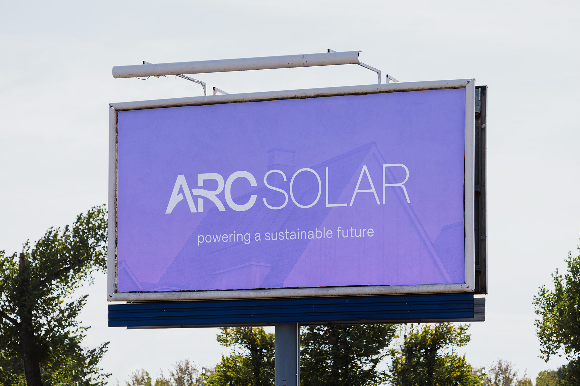
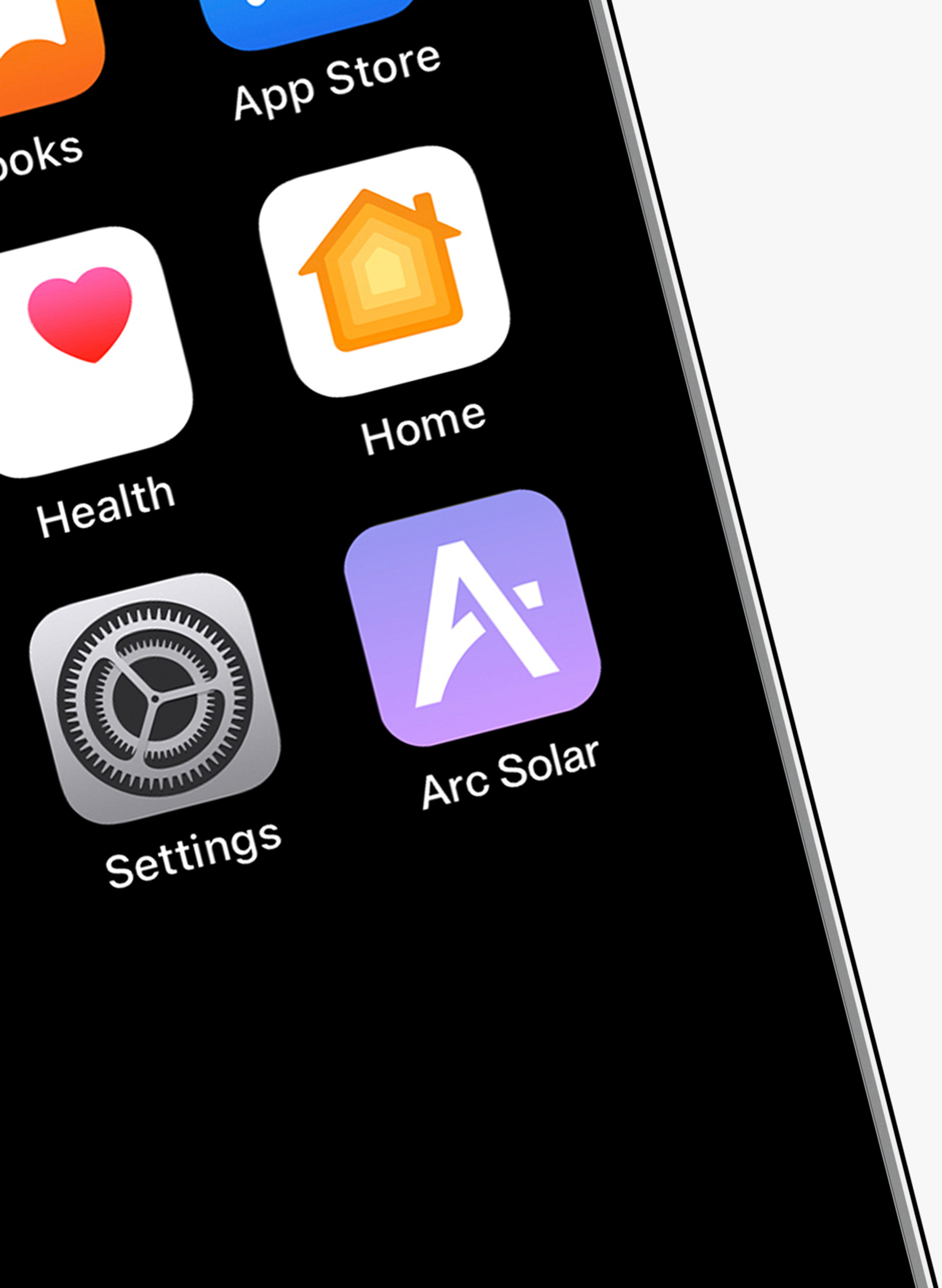
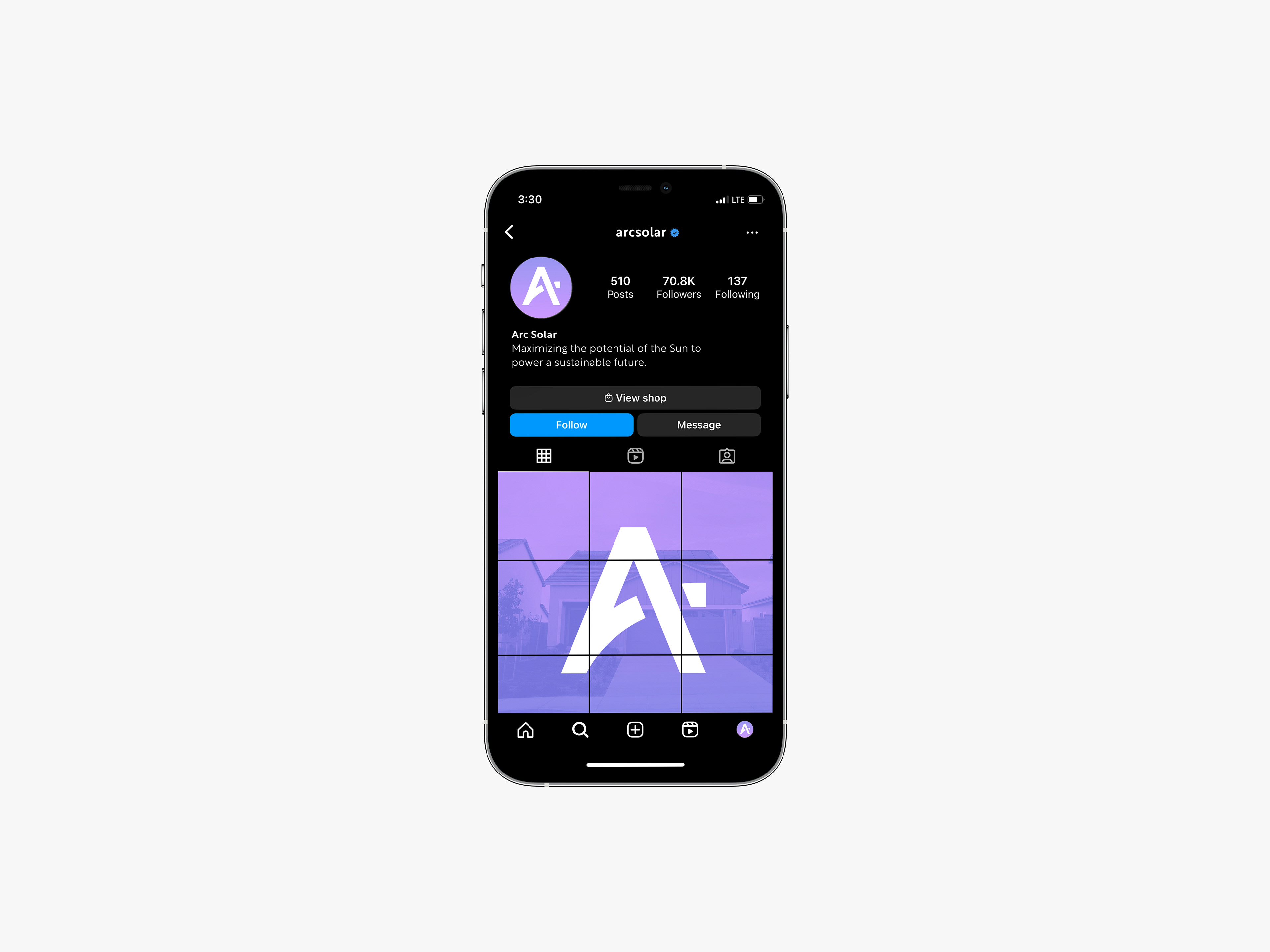
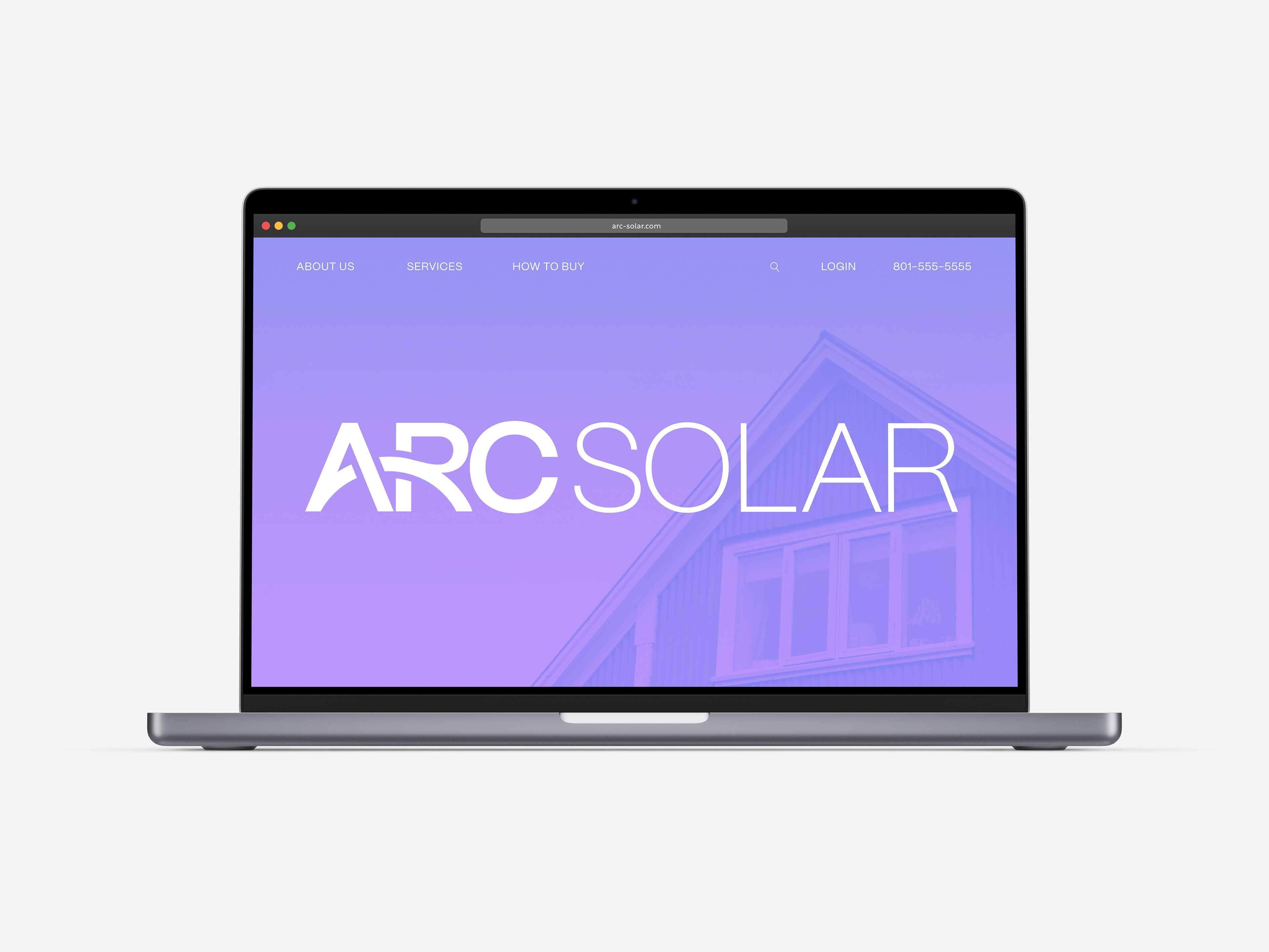
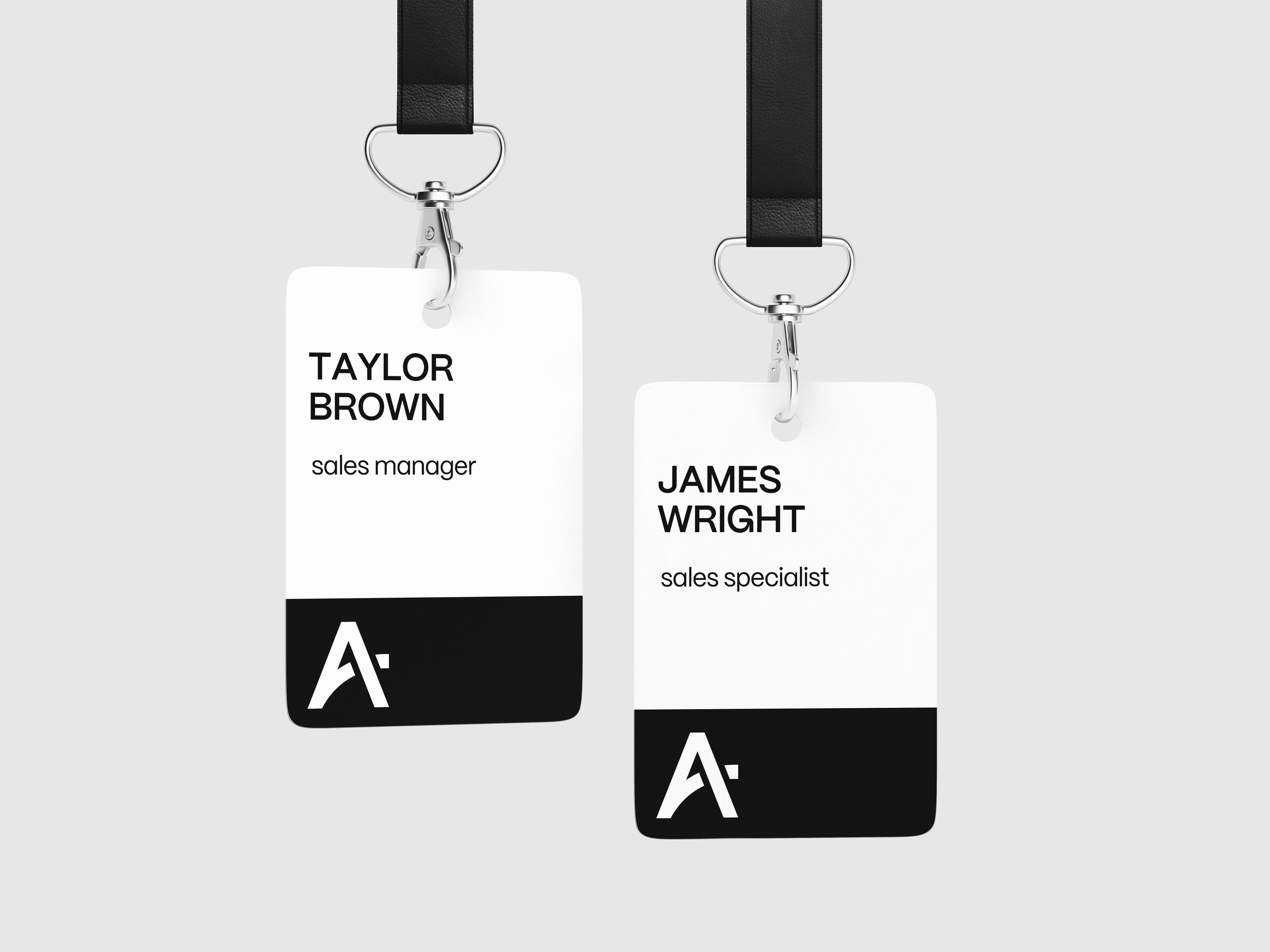
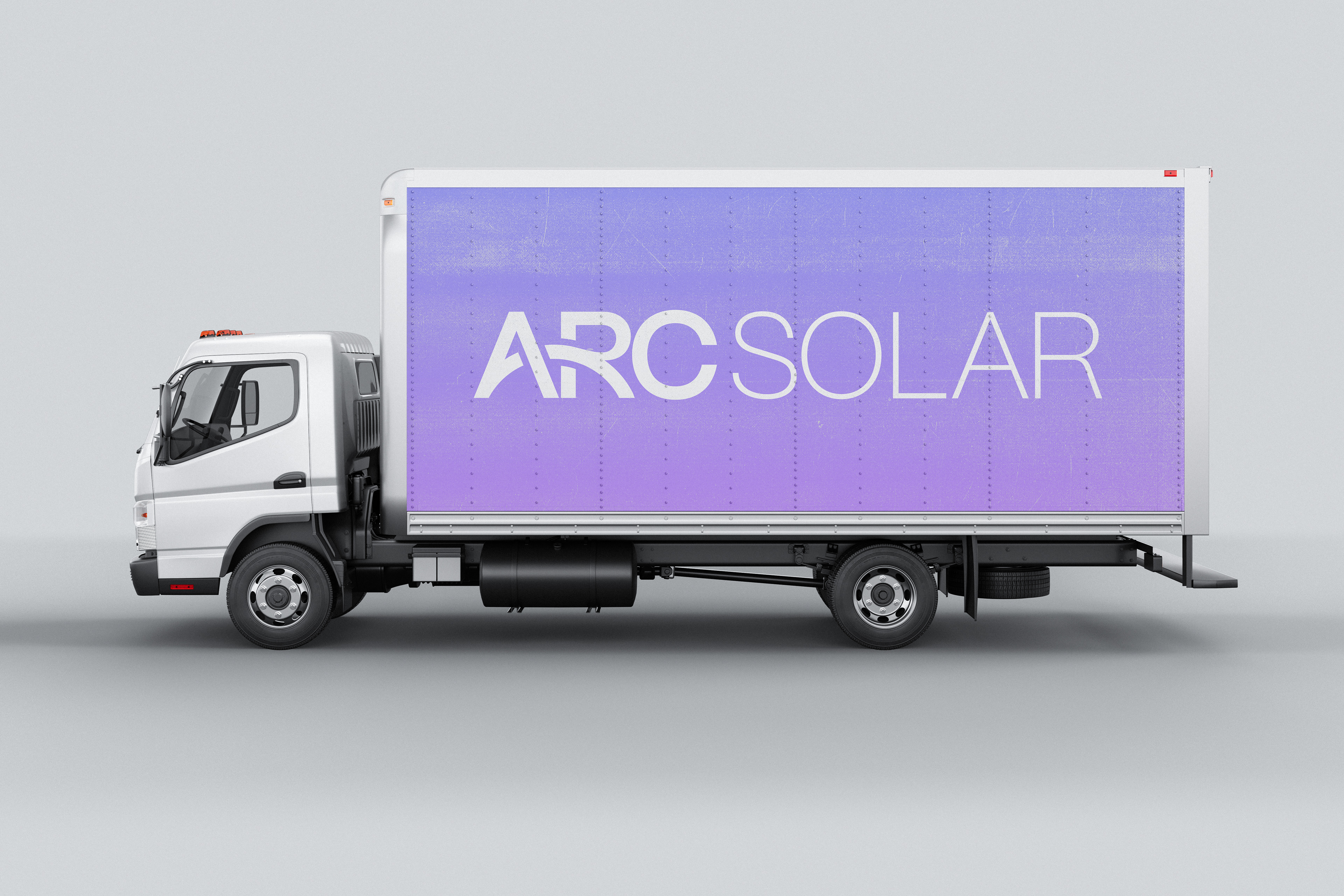
For this conceptual branding project, I created a logo and brand identity for a mock solar company called Arc Solar. The company name is derived from its solar panels' unique ability to maximize light capture by utilizing the entire day arc. The logo mark uses an arc-shaped stroke connecting the crossbar of the “A” and the leg of the “R.” This element gives the logo a subtle illustrative element, and serves as a visual reference to the day arc, the concept at the heart of the brand.
For Arc Solar’s brand colors, I aimed to create a color palette inspired by the sky. To achieve this, I developed a corporate-friendly gradient using colors reminiscent of dusk. I chose this time of day because it conjures images of horizon lines, effectively conveying the optimism in the brand's voice. Furthermore, this gradient symbolizes the changing sky, subtly alluding to the day arc and highlighting the company's unique ability to harness sunlight throughout the entire day.